Wednesday, 24 October 2012

The Simpsons

The Simpsons Movie Booklet

Within this booklet we were asked to create a promotional package for 'The Simpsons Movie'. This needed to include a poster and trailer. We saw this task, as good practice as these were also promotional methods we need to created for our project. The booklet had different modules inside testing out knowledge of Photoshop and iMovie.


 Our lecturer gave us some feed back about the work we produced.


'The Simpsons Movie' trailer


The task set was to create a trailer for The Simpsons Movie. Our project for the year is to create a trailer, so we felt this task was good practiceand appropiate to develop our editing skills on the promgramme iMovie.
We feel we have improved our knowlegde of the promgramme. In refrence to the promgramme our knowlegde was quite basic and brief, but in creating this trailer we experimented with the different tabs to see what was available to us when creating this product. We are now aware of more elements which can use and apply to our end product of our horror trailer. The experience is definately helpful and will be anadvantage when it comes to editing together our horror trailer. Instead of giving more responsibilty to one of the groupmembers that the other we worked toegther 50/50, this ment we collaborated ideas and shared opinions as well compromising so the decisions were made together.

We chose to include the clips we did as The Simpsons, is genreally known as a cartoon comedy. These clips will give a new audience a sense of what to expect and will make the loyal audience aware that filmmakers have been faithful to longrunning series and have not distanced themselves from the well known series.

'The Simpsons Movie' Film Poster 


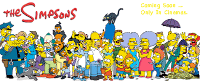
We have also created a promotional film poster for The Simpsons Movie.
We chose to use this specific image asincludes all the characters the audience will typically see and recognise from the cartoon series whom feature in the movie.
We chose the yellow for the 'coming soon...' as we thought yellow is an appropriate colour as it is the characters skin colour and would go with the poster more. However, seeing it now we think it could have been improved. We could have used a different colour instead of the yellow such as red. This might have been a better choice as it would have made it stand out more and would match the other texts on the poster. Therefore, practicing making a film poster has given us more of an idea of what to have in mind while making a film poster.
This has improved our photoshop skills which will be proven useful while doing our main tasks.  

Tuesday, 23 October 2012

Film Poster (Sherlock Holmes)


***


Again we have participated in a task to develop our skills in creating and understanding the representation of characters portrayed in a film poster. By taking part our aim was to reflect our understanding of a actual successful poster, and to apply it to the poster we will make to promote our film and thus we have the ability to make a successful poster which will attract our target audience.

Creating Characters (Sherlock Holmes)


***


We  took part in this activity as we felt it would be useful in developing our skills so when it came to creating our film poster which include still images, we could do so in a successful way which tells the audience about the characters in subtle yet effective ways.
We analysed the various posters used to promote the recent Sherlock Holmes movie and noted any meanings we interpreted about the representation of characters from the way they were presented in the posters.Our course supervisor Helen, has now given us a little feedback she shows she sees we have understood and grasped the concept of this task well.

Inspirational Movie Posters

Our task is to create a promotional package for a new film. This includes a trailer, magazine cover and poster for the film. We have collected, analysed and annotated various film posters for the elements we particularly like and have taken as inspiration.


The film title is Hanna, which has a target over it. The image of the girl using a gun and with cuts on her face suggests she is Hanna whom is being targeted. The canted angle of the image may reflect the characters state of mind as to being target to be killed or hurt. With these elements featured on the poster it is fair to assume the film is in the genre of action. We want to use elements on our poster well enough to make it obvious what the genre of the product is.

On our poster we plan to use high contrast of lighting. This should create the effect of shadows, which will display to the audience mystery and hopefully intrigue them to our film. We think we may use the high key lighting on the poster as a device to portray clearly to the audience who the main characters are and who the victims are. The main image will be the largest element of the poster, however our title is also going to be of a decent size. This is because the title of the film will be how the audience identify our product thus is has to be eye catching and easy to read, so if the poster was at a bus stop and as the bus drove past the potential audience member could read the title and remember it.

The main image will not include a lot of colour, it will me more of a black and white. We will however use one specific colour for each character to connote and  reveal something about their personality and then this will help the audience connect and identify with them.

Our overall aim for the poster is that it will be striking enough to catch someones attention and as a stand alone promotional element would entice them to want to see the film. The elements on our poster will make it clear what the genre of the film is. 


Inspirational Magazine Covers

Our task is to create a promotional package for a new film. This includes a trailer, poster and magazine cover for the film. We collected various magazine covers to analyse and pick out elements we particularly liked and annotated it. 'Empire' is one of the most popular and well known film magazines in the UK, which is why we took samples from this magazine but different issues. 

The price of this magazine is written in English and American currency, suggesting the magazine attracts an audience world wide. Therefore the target audience is the magazine is mass rather than niche. The main headline 'Cowboys & Aliens' has a blue glow to it, linking to the use of aliens in the title and suggests the film is science fiction, identifying its target audience of this particular film immediately. The main image of the cover is of a cowboy, also indicating the film has a western element to it, which identifies another side it the films target audience. 
The badge of the bottom left of the page uses direct mode of address, speaking to the reader of the magazine directly saying 'YOU!' 
The magazine also appears to use the power of persuasion, by including a tagline stating 'MAGAZINE OF THE YEAR' which may easily convince a new reader to buy the magazine.


On this magazine, it uses textual methods to lure the reader into buying. If the potential audience is a fan of the actor Tom Cruise, the magazine has added a badge stating 'CRUISE EXCLUSIVE!', the capitals make it seems as though the magazine has got this just for you. Another badge, mentions a 'FREE!' audio book for every reader, it convinces the reader that because they are getting more than they are paying for they have to buy it. Also, a minor tagline mentions it is the Lord of the Rings '10th BIRTHDAY'. Then elements at the bottom of the page state the party is amazing. Therefore, the reader cannot miss the 'party' and again are convinced to purchase the product.
The name of the magazine is almost always the largest sized font of the page, closely followed by the name of the film being featured and promoted on the cover. We plan to follow this trend, as we feel it sets the standard of the film. We are also applying the feature of the image being almost the whole  size of the page, as by dedicating the whole of the front page to one film image it sends the message to the audience that it is a worthy film to watch. Along with this, we will include a main sell line and a sub headline to explain what the audience can expect of our film. The colours we use in relation to promoting our product will be dark colours, thus they should connote to the audience our genre without  us having to blatantly explain it to them. However we will include some red, as this is often associated with some sort of danger to a character but it can also be  eye catching to the audience amongst all the darker colours will stand out bright. The colours will become a scheme we use for the image and titles on the magazine cover specifically for the main trailer we are promoting, our poster will also follow this colour scheme in some way. It would be worrying, if with all these elements composed on one page the audience did not grasp what genre our product is. 

Empire is a very successful film magazine, thus we will promote other films and their events on our front cover like Empire does with some more minor sell lines. We plan to use some persuasive devices such as direct mode of address, speaking directly to the reader though uses such as 'you'. Also, we want to turn our magazine into a product the reader can't refuse through elements on the cover. We want to make them feel that what they are buying is a 100% exclusive created just for them. It needs to appear to be a bargain to them, so we may advertise a free item to them on our front cover.

Creating a Storyboard

After watching a clip from the film Signs, we attempted to create a story board for the scene for extra practice. We considered all aspects which we thought would give the story board an appropriate layout and content such as:
  • Visual elements
  • Camera angles
  • Camera distances
  • Camera movements
  • Sounds
  • Edits
  • The duration of shots
  • Special effects
  • The set, props, gestures and lighting.


We felt we created the storyboard successfully for the scene we viewed, as we showed the sequence correctly in a way which flowed on the page the same as the audience would see it in film. We added instructions which would be useful and used by the crew in terms of camera shots and angles. Also we indicated where the character would carry out dialogue or actions.
This helped up to develop the skill of creating storyboards as by practicing, it helped us understand the elements it includes and why. Now we both feel more confident that we can produce a decent one including all the necessary elements that will be included in our trailer.

Wednesday, 17 October 2012

Scenario

We were set a scenario which we thought by completing would be beneficial to our final product as it would give us some practice. This scenario was: 
  • Two friends, A and B, are waiting for an important message.
  • The text is received. A opens the text message.
  • A shows B the text message.
The aim was to build drama through the use of camera work, language, framing, mise en scene, sound and editing.

To begin, we made a mind map of suggestions of what to do for the various aspects. This was basically just to get all of our ideas onto paper, so we could then move of to recognising which ideas were better suited to the task at hand.


We then moved on to creating a storyboard. This plan helped to arrange the idea into a sequence so we could easily follow in chronological order what we were doing. It played as instructions to what we were doing with the camera. It also indicated any actions to be made by the characters. As we created the storyboard for the scenario, we included all elements of the story board frame to keep the layout appropiate.


This is our final product:

Through the sound of the ticking clock, we tried to create some sort of suspense, and to highlight the fact the characters where waiting for something of importance. The characters movement shows nerves, that they cant keep still. We kept the camera stationary at this point, so the character walked in and out of frame therefore the audience would not be fully focused on this character but would be aware of other features of the room such as the other character fidgeting with the phone, which has significance to the the scenario. The character then approaches the window and the camera positioned behind them as a mid shot, showing the character looking out, waiting. As a beep occurs to let the audience know the text message has been received, the characters suddenly turn to look at each others and the sound used give the action a dramatic effect. 
Whilst in editing we realised that the lighting of the room slighting changed throughout, this was an uncontrollable factor as the lighting used was natural and they sun ever so slightly changed it position outside as we filmed which altered the lighting of the whole room. 


Overall, we found this task beneficial as it was a great basic way of how to plan out the idea for the product. It shows the audience our train of thought whilst we were creating the clip, and the plans were easy for us as producers to refer back to as we were in the process of filming.